
If you’re new to web development or simply trying to decide which layout tool to use, you may be wondering about the differences between CSS Grid and Flexbox. While both CSS Grid and Flexbox can be used to create complex and dynamic layouts, they each have their own strengths and weaknesses that make them better suited for different use cases.
In this article, we’ll explore the top 5 key differences between CSS Grid and Flexbox, providing real-world examples and code snippets to help you decide which tool is best suited for your project. Whether you’re looking to create a responsive website or a complex dashboard, understanding these differences will give you the knowledge to make an informed decision about which layout tool to use.
CSS Grid and Flexbox are both CSS layout models that allow developers to create complex web page layouts with ease. However, they have different use cases and are best suited for different layout requirements. CSS Grid is a two-dimensional layout model that allows you to create complex layouts with rows and columns. On the other hand, Flexbox is a one-dimensional layout model that allows you to create flexible layouts in a single row or column.Use case: Complex Grid Structures
CSS Grid excels at creating complex grid structures, making it the ideal choice for projects that require more intricate layouts, such as a responsive e-commerce site with a grid of products.
<div class="grid-container">

	<div class="grid-item"></div>


	<div class="grid-item"></div>


	<div class="grid-item"></div>

</div>
.grid-container {
  display: grid;
  grid-template-columns: repeat(3, 1fr);
  grid-gap: 10px;
}

.grid-item {
  background-color: #eee;
  padding: 20px;
  text-align: center;
}
Use case: One-Dimensional Layouts
Flexbox is designed to create one-dimensional layouts, which makes it ideal for layouts that require items to be aligned in a single row or column, such as a navigation bar.
<nav>
  <ul class="nav-list">
    <li class="nav-item">Home</li>

    <li class="nav-item">About</li>

    <li class="nav-item">Contact</li>
  </ul>
</nav>
.nav-list {
  display: flex;
  justify-content: space-between;
}

.nav-item {
  padding: 10px;
}
Use case: Complex Multi-Directional Layouts
CSS Grid has the ability to create complex multi-directional layouts, making it a great choice for projects that require elements to be positioned in both rows and columns, such as a dashboard.
<div class="grid-container">
  <div class="header">Header</div>

  <div class="sidebar">Sidebar</div>

  <div class="content">Content</div>

  <div class="footer">Footer</div>
</div>
.grid-container {
  display: grid;
  grid-template-areas:
    "header header header"
    "sidebar content content"
    "sidebar footer footer";
  grid-template-columns: 200px 1fr 1fr;
  grid-template-rows: 100px 1fr 50px;
}

.header {
  grid-area: header;
  background-color: #ddd;
}

.sidebar {
  grid-area: sidebar;
  background-color: #bbb;
}

.content {
  grid-area: content;
  background-color: #999;
}

.footer {
  grid-area: footer;
  background-color: #ccc;
}
Flexbox is great for aligning items within a container. It provides a variety of alignment options, including align-items, justify-content, and align-content. CSS Grid also provides similar alignment options, but it is designed to work with a grid-based layout, which means it has more complex alignment options.
CSS Grid Example:
<div class="grid-container">
  <div class="grid-item">Item 1</div>

  <div class="grid-item">Item 2</div>

  <div class="grid-item">Item 3</div>

  <div class="grid-item">Item 4</div>

  <div class="grid-item">Item 5</div>

  <div class="grid-item">Item 6</div>
</div>
.grid-container {
  display: grid;
  grid-template-columns: repeat(2, 1fr);
  grid-template-rows: repeat(3, 100px);
  grid-gap: 10px;
}
In this example, we are creating a 2×3 grid with a gap of 10 pixels between each item.
Flexbox Example:
<div class="flex-container">
  <div class="flex-item">Item 1</div>

  <div class="flex-item">Item 2</div>

  <div class="flex-item">Item 3</div>

  <div class="flex-item">Item 4</div>

  <div class="flex-item">Item 5</div>

  <div class="flex-item">Item 6</div>
</div>
.flex-container {
  display: flex;
  flex-direction: column;
  justify-content: space-between;
  align-items: center;
}

.flex-item {
  background-color: #ddd;
  padding: 20px;
  text-align: center;
  flex-basis: calc(33.33% - 20px);
}
In this example, we are creating a column of six items using Flexbox.
CSS Grid allows you to nest grids inside other grids, which means you can create more complex layouts. Flexbox does not have this capability and is better suited for simpler layouts.CSS Grid Example:
<div class="grid-container">
  <div class="grid-item">Item 1</div>

  <div class="grid-item">Item 2</div>

  <div class="grid-item">Item 3</div>

  <div class="sub-grid-container">
    <div class="sub-grid-item">Sub Item 1</div>

    <div class="sub-grid-item">Sub Item 2</div>

    <div class="sub-grid-item">Sub Item 3</div>
  </div>

  <div class="grid-item">Item 4</div>

  <div class="grid-item">Item 5</div>
</div>
.grid-container {
  display: grid;
  grid-template-columns: repeat(3, 1fr);
  grid-template-rows: repeat(2, 100px);
  grid-gap: 10px;
}

.sub-grid-container {
  display: grid;
  grid-template-columns: repeat(3, 1fr);
  grid-template-rows: repeat(1, 100px);
  grid-gap: 10px;
}

.grid-item {
  background-color: #ddd;
  padding: 20px;
  text-align: center;
}

.sub-grid-item {
  background-color: #bbb;
  padding: 10px;
  text-align: center;
}
In this example, we are creating a 2×3 grid with a nested 1×3 grid inside the fourth item.
Flexbox Example:
<div class="flex-container">
  <div class="flex-item">Item 1</div>

  <div class="flex-item">Item 2</div>

  <div class="flex-item">Item 3</div>

  <div class="flex-item sub-flex-container">
    <div class="sub-flex-item">Sub Item 1</div>

    <div class="sub-flex-item">Sub Item 2</div>

    <div class="sub-flex-item">Sub Item 3</div>
  </div>

  <div class="flex-item">Item 4</div>

  <div class="flex-item">Item 5</div>
</div>
.flex-container {
  display: flex;
  flex-direction: row;
  justify-content: space-between;
  align-items: center;
}

.sub-flex-container {
  display: flex;
  flex-direction: column;
  justify-content: space-between;
  align-items: center;
}

.flex-item {
  background-color: #ddd;
  padding: 20px;
  text-align: center;
  flex-basis: calc(33.33% - 20px);
}

.sub-flex-item {
  background-color: #bbb;
  padding: 10px;
  text-align: center;
  flex-basis: calc(33.33% - 20px);
}
In this example, we are creating a row of six items with a nested column of three items inside the fourth item.
Both CSS Grid and Flexbox allow you to align items along both the horizontal and vertical axes, but the methods for doing so are different.
CSS Grid Example:
<div class="grid-container">
  <div class="grid-item">Item 1</div>

  <div class="grid-item">Item 2</div>

  <div class="grid-item">Item 3</div>

  <div class="grid-item">Item 4</div>

  <div class="grid-item">Item 5</div>

  <div class="grid-item">Item 6</div>
</div>
.grid-container {
  display: grid;
  grid-template-columns: repeat(3, 1fr);
  grid-template-rows: repeat(2, 100px);
  grid-gap: 10px;
  justify-content: center;
  align-items: center;
}

.grid-item {
  background-color: #ddd;
  padding: 20px;
  text-align: center;
}
In this example, we are creating a 2×3 grid and centering the items both horizontally and vertically.
Flexbox Example:
<div class="flex-container">
  <div class="flex-item">Item 1</div>

  <div class="flex-item">Item 2</div>

  <div class="flex-item">Item 3</div>

  <div class="flex-item">Item 4</div>

  <div class="flex-item">Item 5</div>

  <div class="flex-item">Item 6</div>
</div>
.flex-container {
  display: flex;
  flex-wrap: wrap;
  justify-content: center;
  align-items: center;
}

.flex-item {
  background-color: #ddd;
  padding: 20px;
  text-align: center;
  flex-basis: calc(33.33% - 20px);
}
In this example, we are creating a row of six items and centering the items both horizontally and vertically.
Flexbox allows you to change the order of items within a container, which can be useful for mobile-first designs where you want to move certain items to the top or bottom on smaller screens. CSS Grid does not have this capability.Flexbox Example:
<div class="flex-container">

<div class="flex-item">Item 1</div>


<div class="flex-item">Item 2</div>


<div class="flex-item">Item 3</div>


<div class="flex-item">Item 4</div>


<div class="flex-item">Item 5</div>


<div class="flex-item">Item 6</div>

</div>
.flex-container {
  display: flex;
  flex-wrap: wrap;
}

.flex-item {
  background-color: #ddd;
  padding: 20px;
  text-align: center;
  flex-basis: calc(33.33% - 20px);
}

@media (max-width: 767px) {
  .flex-item:nth-child(3) {
    order: -1;
  }
}
In this example, we are creating a row of six items and using a media query to move the third item to the beginning of the row on screens smaller than 768px.
In terms of browser support, both CSS Grid and Flexbox have good support across modern browsers, but there are somedifferences to keep in mind:
- CSS Grid has slightly lower overall support than Flexbox, but it is still widely supported across modern browsers. According to CanIUse, CSS Grid has around 92% global browser support, while Flexbox has around 97% global support.
- Older browsers such as Internet Explorer 11 do not support CSS Grid, but there are workarounds available such as using a polyfill or providing a fallback layout using Flexbox or another layout method.
- Flexbox has better support for older versions of Safari, iOS, and Android browsers. In particular, Safari versions prior to 10.1 have incomplete support for CSS Grid, so using Flexbox may be a better option if you need to support these browsers.
- Some newer features of CSS Grid, such as subgrid and masonry layout, are still not widely supported across all browsers. However, these features are not essential for basic grid layouts and can be implemented using other techniques if needed.
About the author /
Mohamed Rias
Popular


Editor’s Pick
-
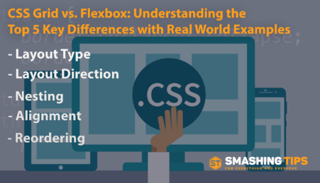
April 5, 2023 CSS Grid vs. Flexbox: Understanding the Top 5 Key Differences with Real World Examples
If you’re new to web development or simply trying to decide which layout tool to use, you may be wondering about the differences between CSS Grid and Flexbox. While both CSS Grid and Flexbox can be used to create complex and dynamic layouts, they each have their own strengths and weaknesses that make them better…
-
June 10, 2012 Show Recent Posts With Thumbnail from Particular Label/Category in Blogger
Hey Blogger friends, Today i have come up with another cool blogger hack. It’s about showing recent posts with/without thumbnail from any particular label/category in blogger. As you can see in my sidebar, I have listed recent posts from each category, but i have done this in wordpress. So if you want to do same…
-
January 11, 2010 Ultimate Twitter Tools and resources
Twitter, the micro-blogging platform that has taken the Internet by storm, has so much to offer the online entrepreneur or personal user, yet is misunderstood by many people. Twitter not only allows you to tell the world “what I am doing right now” via its web interface, but can also be integrated and enhanced by…
-
April 22, 2023 Webpack vs Vite: Choosing the Right Build Tool for Your Next Web Project
In web development, build tools are essential for frontend developers to efficiently organize, compile and optimize their codebase. These tools automate the process of transforming source code into a production-ready format, which saves time and makes it easier to maintain projects in the long run. Two of the most popular build tools for modern web…
-
December 15, 2012 Tips to shoot excellent Panoramic Photographs
Recently, making out panoramic photos has become much easier as your software stitches them quite beautifully together. Photoshop is quite skillful and master in doing that; it has got a command called Photo Merge that weaves your photos once you hit it. Now, software is mere medium which we use to ease our post works,…